
The winner of a packet of beads and buttons to embellish her quilt art is Bonnie58. I have sent her an email for her snail mail information.
Thank you all for a great Blog Hop, I’m sorry everyone couldn’t win. Keep quilting!
Uncategorized
Summertime on the Porch

Ron and I have been busy painting in this heat. The outside was looking a little worn so we started with our curb appeal first thing. Well, this used to be what the builder intended to be our front porch since it faces the other villas on the sidewalk. But we’ve done a switch because we put in a new sidewalk to the street on the backside and that’s the way everyone seems to come into our home.
This is now our patio area with some high antique wrought iron planters to help screen us from prying eyes. Sorry, you can’t see them in this photo. I bought the happy outdoor fabric for the cushions in McAllen, TX.It makes me smile. The vine is a hyacinth purple bean that isn’t doing well in the heat but I’m hoping it will bloom when it cools down some. You can find some photos HERE You can tell this one has a long way to go so keep your fingers crossed for me.
The porch floor is a dark olive green and the walls are a pale sand color. The trim is a dark sand, sort of the color of wet lake sand, not the white quartz sand you see on Gulf beaches. But one of the parts I like the best is the porch ceiling.

While sitting at the docs I saw a photo of a lakeside Inn that had the porch ceiling painted this color. I was in love. I mixed lots of odds and ends from the storage room to come up with this sea blue-green. The photo is a little darker than the real color but I think you get the idea. You only see it when you get close to the house and its a nice surprise.
Ron mentioned after we painted this that he remembers that the porches of his youth were all painted colors. He said they were never as pretty as this.
I plan on spending a lot of time out here when it cools down some. Lots of room to sit and spin or do some hand stitching.
June Arts In The Cards ATC trade – Dew

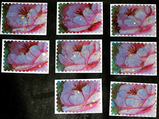
When I think of dew and colors that might represent it, I can’t help but think of early morning light. If you aren’t out early to see the contrasts, dew is just simply….wet.
The problem comes with how to recreate morning light. Qualities of light are something painters have struggle to depict for centuries. I had a photo of a pink peonie taken in early light that shows dew on the petals. This was my inspiration for this trade.
I first printed the photograph and then did 2 transfers, one onto rice paper and one onto a thin muslin that is more like cheesecloth. I wanted to do a layered, holographic image but the top layer was too heavy to see the rice paper. I had already coated the rice paper with modge podge and glittered the image for dew. Rather than toss this to the curb [my first inclination] I kept working with it.
I layered the cloth image onto the rice paper and stitched around just enough of the petals to give the impression of the peonie and stamens. I used liquid water color to darken the leaves in the background and to darken the stamens. Each card is different and some have a blush of red to enhance the pink petals. The blues are from the photograph and are the morning shadows that contrast with the light petals in the foreground where the early light hit the petals. A small amount of glitter and 3 large drops of dew using glass sequins are on each card. The camera picked up the bottom layer of glitter, too.
I love these color inspirations trades and think the artists in our group have really stretched to find their inspiration for them.
Native American Influence ATC
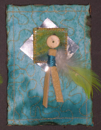
I’ve been out of commission for awhile with a health issue so this was my first trade since I could work again. Turquoise is probably my most favorite color, in all values and shades that the natural stone comes in. It is a color that shows up in my quilts and paintings more than any other.
I have a large collection of Native American turquoise and sterling silver jewelry that I wear all the time and one piece is never enough.
I wanted these cards to mimic my favorite things and the original plan was to use silver wire and beads in them, but my hands weren’t cooperating to finish them the way I wanted to. The next best thing was to find some silver reflective window film to add the silver to my pieces.
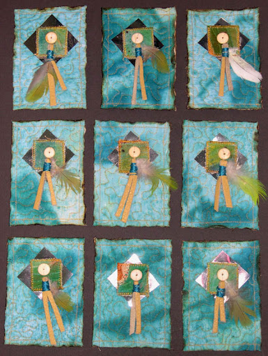
The background is some of my hand painted fabric that is quilted with gold thread. The inchie in the middle is cut from my SAQA donation quilt left over pieces. Each one is adorned with a thin buckskin strip and tiny feather. The roundel is natural wood that I thought mimics bone beads. Because these were quilted with poly batting, I was able to seal the edges by burning with a wood burning tool.
I hope you all like them. Oh yes, because Mathea lives in New Zealand there is one card without a feather. I would hate for it to be confiscated out of the mail!
Happy Cinco De Mayo
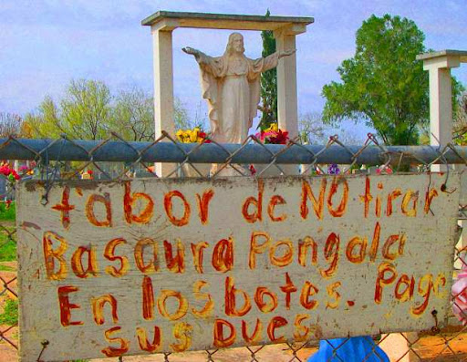 |
| Taken at a cemetery along the border of Texas and Mexico. This photo was shown at the Houston Quilt Show in The Eye of the Quilter photography exhibit. |
