Let’s talk about artistic voice

 All artists wonder if they have a voice and how to know if they have one.  There may be as many opinions about this as there are artists. There are many articles both off and online on how to discover your voice. Here are two of them: http://blog.talenthouse.com/2012/02/25/10-ways-to-find-your-artistic-voice/  and http://artbistro.monster.com/benefits/articles/12710-finding-your-own-artistic-voice

I have never been able to describe my voice, though an artist statement should be a little about voice. But then I don’t have an effective artist statement either!  I guess that’s something else I have to work on.  

 There is an exhibit coming up for our regional SAQA group. It’s a quicky that came up sort of last minute. We can send one or two pieces and they will be for sale at the venue.  I need to get back in the swing of things after my fallow period due to health so I don’t want to pass this opportunity by. 

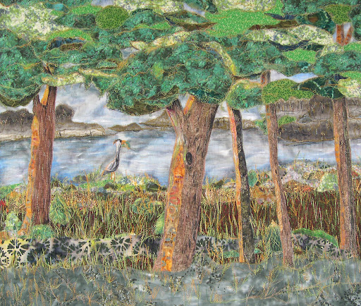
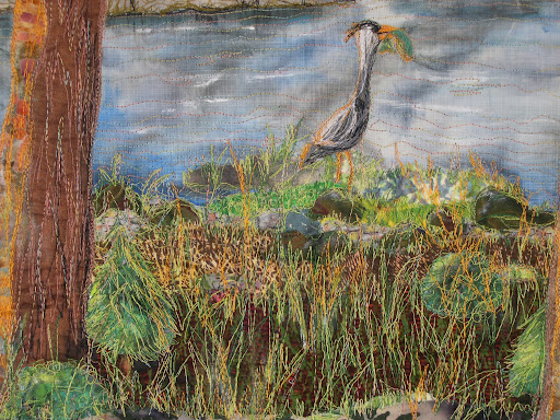
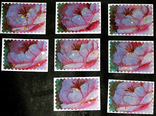
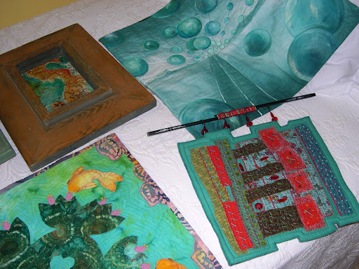
I pulled out the under-the-bed gallery to decide what to send. As I placed them  on the white bedspread it struck me that maybe I have a voice after all. I certainly have a go-to color palette and everything is very organic

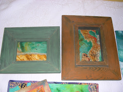
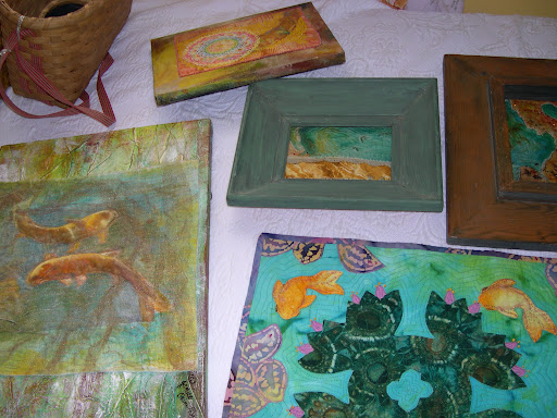
Here are two more pieces left over from the SAQA donation quilt. I love how they look in these big chunky frames.  I couldn’t have planned these pieces from scratch to look any better than these left overs do.

So what do you all think. Do I have a voice that is obvious when you look at these few pieces grouped together?

Summertime on the Porch

 Ron and I have been busy painting in this heat. The outside was looking a little worn so we started with our curb appeal first thing. Well, this used to be what the builder intended to be our front porch since it faces the other villas on the sidewalk. But we’ve done a switch because we put in a new sidewalk to the street on the backside and that’s the way everyone seems to come into our home.

This is now our patio area with some high antique wrought iron planters to help screen us from prying eyes. Sorry, you can’t see them in this photo.  I bought the happy outdoor fabric for the cushions in McAllen, TX.It makes me smile. The vine is a hyacinth purple bean that isn’t doing well in the heat but I’m hoping it will bloom when it cools down some.  You can find some photos HERE You can tell this one has a long way to go so keep your fingers crossed for me.

The porch floor is a dark olive green and the walls are a pale sand color. The trim is a dark sand, sort of the color of wet lake sand, not the white quartz sand you see on Gulf beaches. But one of the parts I like the best is the porch ceiling.

While sitting at the docs I saw a photo of a lakeside Inn that had the porch ceiling painted this color. I was in love. I mixed lots of odds and ends from the storage room to come up with this sea blue-green. The photo is a little darker than the real color but I think you get the idea. You only see it when you get close to the house and its a nice surprise.

Ron mentioned after we painted this that he remembers that the porches of his youth were all painted colors. He said they were never as pretty as this.

I plan on spending a lot of time out here when it cools down some. Lots of room to sit and spin or do some hand stitching.

White River Hope Sold!

White River Hope was sold at the All About Art show and sale that was held in Elkins Park, PA.

This art quilt had been juried into the Denver National show, the Wisconsin Expo and was shown in a local show. It had already been a money winner with a first place and the most original quilt at the local show.  It also was in Machine Quilting Unlimited as a noteworthy quilt after appearing at the Denver National.

Before sending this quilt off to the sale I put a new label on the back that listed where the quilt had been shown and documented its winnings. I did this by painting on a white label and wrote the information in India Ink. My signature is buried somewhere in the stitching on the front.

The quilt is composed of collaged fabrics with heavy thread sketching for the quilting. The great blue heron and the trout in his mouth are hand guided machine embroidered.

I am pleased as punch!  Many years ago when I did traditional quilting, and before becoming disabled, I sold some quilts. This was my first big sale for an art quilt. I hope this won’t be the last!

Little LuLu’s New Bed

Not for long,  I had to take it back.  I’ve been sorting and destashing all my fibers. On the list last night was a tub of yarns and this old wicker picnic basket of yarns.  I left the room for just a few minutes when Ron called me.

We heard  a crinkling noise  coming from the family room. I pretty much knew what it was. LuLu has never seen a basket she didn’t like and if it is full of yarns, stuffed toys or quilts she likes it even more.

She may have been a cat in a former life…just look at that un-canine like yawn on her little face.

June Arts In The Cards ATC trade – Dew

When I think of dew and colors that might represent it, I can’t help but think of early morning light. If you aren’t out early to see the contrasts, dew is just simply….wet.

The problem comes with how to recreate morning light. Qualities of light are something painters have struggle to depict for centuries.  I had a photo of a pink peonie taken in early light that shows dew on the petals. This was my inspiration for this trade.

I first printed the photograph and then did 2 transfers, one onto rice paper and one onto a thin muslin that is more like cheesecloth.  I wanted to do a layered, holographic image but the top layer was too heavy to see the rice paper. I had already coated the rice paper with modge podge and glittered the image for dew. Rather than toss this to the curb [my first inclination] I kept working with it.

I layered the cloth image onto the rice paper and stitched around just enough of the petals to give the impression of the peonie and stamens. I used liquid water color to darken the leaves in the background and to darken the stamens. Each card is different and some have a blush of red to enhance the pink petals. The blues are from the photograph and are the morning shadows that contrast with the light petals in the foreground where the early light hit the petals. A small amount of glitter and 3 large drops of dew using glass sequins are on each card. The camera picked up the bottom layer of glitter, too.

I love these color inspirations trades and think the artists in our group have really stretched to find their inspiration for them.